
The 4th Quarter finally gave investors some hope again after a brutal first 3 quarters. For the quarter, the S&P 500 Index gained 7.56%, Small Cap Equities were up 9.19%, Non-US equities jumped 14.28% and bonds increased by 1.87%. While the quarter provided a bit of relief, all major risk assets finished sharply lower for the year as there were very few places to hide during the volatile year. Against this extremely tough backdrop, the gross Overlay strategy return was +1.30% for the quarter and finished down 3.36% for the year. This negative contribution has resulted in YTD underperformance in the separate account strategies and the funds.
ANNUALIZED SEPARATE ACCOUNT ILLUSTRATIVE RETURNS (Net1)
11/01/2013 - 12/31/2022
| Q4 | 1 YEARS | 3 YEARS | 5 YEARS | Inception to Date | |
| Large Cap Equity Strategy | 8.58% | -22.10% | 7.19% | 8.17% | 12.34% |
| S&P 500 Index | 7.56% | -18.11% | 7.66% | 8.79% | 11.01% |
| Small Cap Equity Strategy | 10.02% | -20.24% | 5.27% | 4.65% | 9.66% |
| S&P 600 Index | 9.19% | -16.10% | 5.80% | 5.88% | 8.41% |
| Foreign Equity Strategy | 13.53% | -17.79% | -2.53% | -0.68% | 4.47% |
| MSCI ACWI ex US MinVol | 14.28% | -16.00% | 0.07% | 0.88% | 2.67% |
| Core Bond Strategy | 2.70% | -16.77% | -2.83% | -0.74% | 2.79% |
| Bbg Barc US Aggregate Index | 1.87% | -13.01% | -2.71% | 0.02% | 1.27% |
| Short Term Bond Strategy | 3.18% | -9.59% | -0.55% | 0.59% | 3.14% |
| Bbg Barc US Corp 1-5 Yr TR | 1.78% | -5.56% | -0.41% | 1.26% | 1.55% |
| Municipal Bond Strategy | 4.81% | -11.30% | -0.56% | 0.55% | 3.97% |
| Bbg Barc Muni Bond Index | 4.10% | -8.53% | -0.77% | 1.25% | 2.57% |
1Net of fees assumes a 0.75% management fee applied monthly. The three, five and ITD are shown annualized. These returns are illustrative, hypothetical numbers representative of two actual return streams (Liquid Strategies Overlay and the underlying index ETF). The numbers illustrate what would have happened had we taken the underlying index ETF returns and added Liquid Strategy Overlay returns to them. Source: Morningstar, Liquid Strategies.
HEDGED LARGE CAP EQUITY SINCE INCEPTION RETURNS (Net1)
06/30/2019 - 12/31/2022
| Inception to Date | |
| Annualized Return (Net) | 7.69% |
| Annualized Volatility | 12.17% |
| Sharpe Ratio | 0.59 |
| Max Drawdown | -19.25% |
| Beta vs S&P 500 | 0.58 |
| Up Capture | 65.40% |
| Down Capture | 61.02% |
OVERLAY STRATEGY ANNUALIZED PERFORMANCE
11/01/2013 - 12/31/2022
| Q3 | 1 YEARS | 3 YEARS | 5 YEARS | Inception to Date | |
| Overlay Strategy (Gross) | 1.30% | -3.37% | 0.80% | 0.11% | 2.34% |
| Overlay Strategy (Net) | 1.11% | -4.09% | 0.04% | -0.64% | 1.58% |
Net of fees assumes a 0.75% management fee applied monthly.
*Hypothetical/Illustrative performance is not an indicator of future actual results. The results reflect performance of a strategy not offered to investors during the time indicated in the analysis and do not represent returns that any investor actually attained. Hypothetical/Illustrative results are calculated by the retroactive application of the Overlay strategy constructed on the basis of historical data combined with other existing independently-managed ETFs and based on assumptions integral to this presentation which may or may not be testable and are subject to losses. General assumptions include: The manager would have been able to purchase securities in a single portfolio with similar characteristics to the Overlay Strategy and the Index ETFs recommended by the illustration, and the markets were sufficiently liquid to permit all trading. Indexes used for comparative purposes cannot be traded, however there are securities, funds, and similar investments that can be purchased to obtain similar results and include no fees. Changes in these assumptions may have a material impact on the hypothetical returns presented. No representations and warranties are made as to the reasonableness of the assumptions. This information is provided for illustrative purposes only. Actual performance may differ significantly from hypothetical/illustrative performance. Source: Morningstar, Bloomberg, L.P., Liquid Strategies.
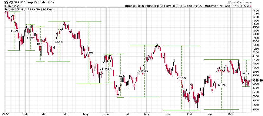
While everyone felt the market volatility at some point in the year (some felt it more than others), as the charts below illustrate, it was actually one of the most volatile years ever. It started with the first half of the year, which was the worst for the S&P 500 Index since 1970. The volatility picked up steam in Q3 with wild swings up 18% and then back down 18% in short periods of time.
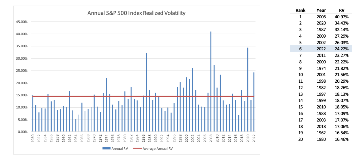
The realized volatility (which measured that actual historic volatility of the market) was the 6th highest going back to 1950. The year had really “good” company with the Great Financial Crisis and 1987.
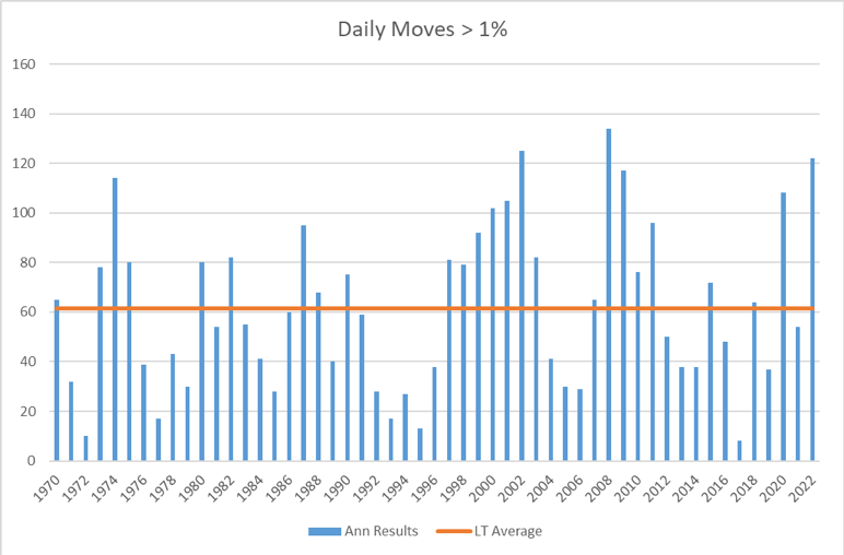
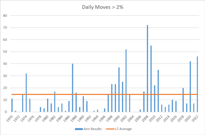
Another good measure of market volatility is the number of days that the market moves +-1% or +-2% in a year. As the below charts show, 2022 was certainly near the top in both categories as big daily swings became the normal.
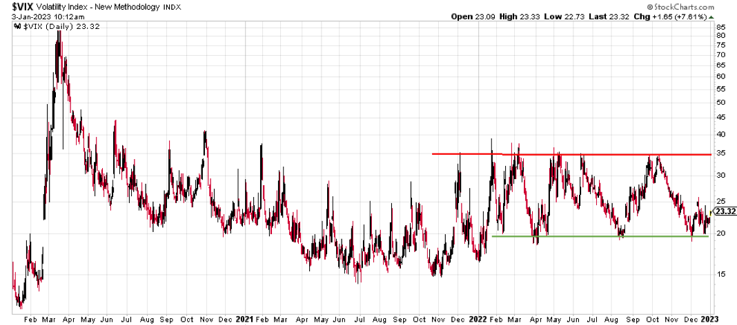
The CBOE Volatility Index (the “VIX”), which measures expected future market volatility, stayed between a very clear band for the entire year with a pronounced floor at 20 and ceiling at 35. The index will eventually break out of this range, and if it breaks to the downside (volatility expectations are lower) that would give me greater hope that we have moved into recovery phase.
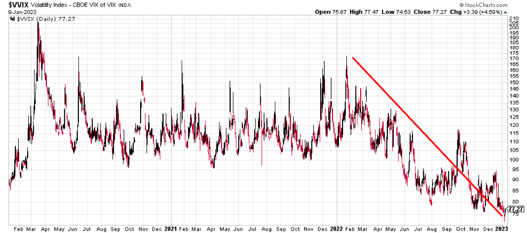
Not only has the level of the VIX started to stabilize some between 20 and 25, the Volatility of the VIX (“VVIX”) shows that “Vol of Vol” has collapsed indicating that market participants are becoming increasingly comfortable with the amount of risk already priced into the market.
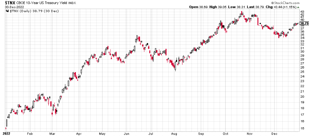
Bonds did not provide the normal ballast investors expect during times of stress as interest rates ripped higher. The 10-year treasury yield moved from close 1.5% at the start of the year up to nearly 3.9% at year end. As a result of this sharp move higher in rates, 10-year treasury bonds lost money for the second straight year, something that has not happened since the 1950s. While equity volatility appears to be moderating, interest rate volatility, as measured by the MOVE Index, continues to sit at very elevated levels.
While many parts of the fixed income market may have some decent opportunities, high yield bonds have yet to see a spike in credit spreads that you would expect during times like these. This is especially surprising given the fact that the interest expense of many of these companies could spike significantly as bonds mature and need to be refinanced. This could put significant strain on the balance sheets of non-investment grade issuers.
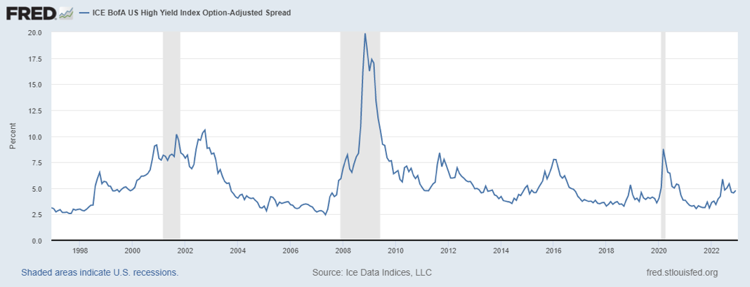
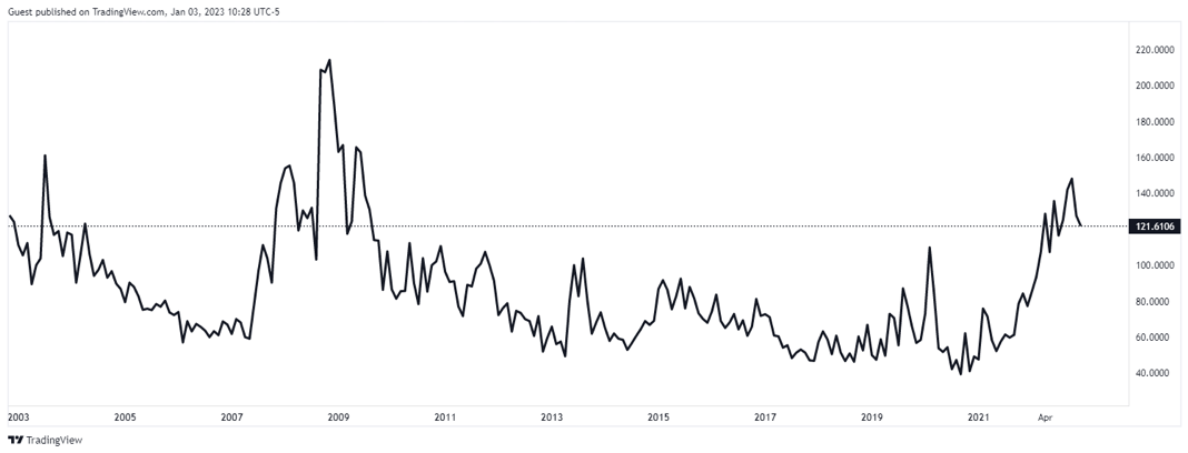
.png?width=1168&height=450&name=fredgraph%20(12).png)
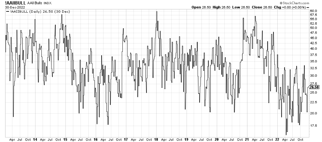
Doom and gloom is being preached on a daily basis by most market pundits. Investors are still very bearish (see chart below), and are fearful of a retest of the lows of the year, and potentially a move to new lows. The ending of bear markets is a process that can be quite gut wrenching as value investors step in while other investors panic and exit. The markets will eventually climb a “wall of worry” to return to new highs, and this will come as a big surprise to many investors because the market can easily start to recover 3-6 months before a change in fundamentals is obvious. While there is no way of knowing if “the” bottom has been reached, we are likely closer to the end of this volatility than the beginning. One key will be that investors get comfortable with the idea that we already hit peak inflation and that the Fed will soon be able to pivot to a neutral policy stance.
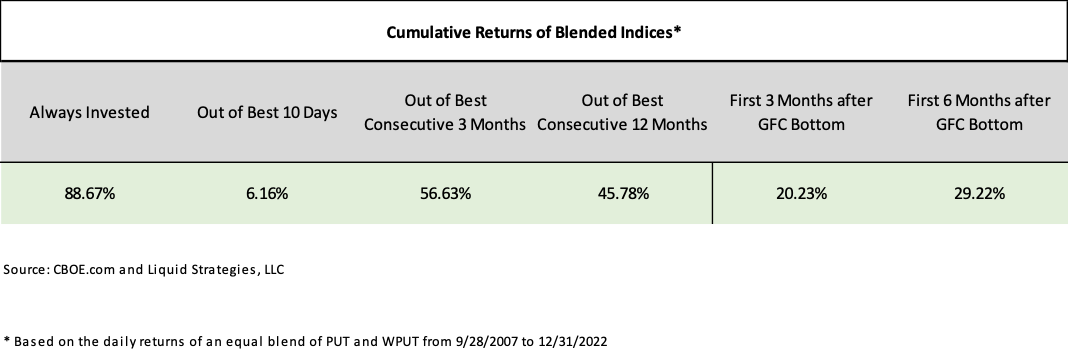
Over the years, charts are shared with investors on the importance of staying invested, as being out of the market even for a brief period of time can significantly degrade returns. This is certainly the case with put writing strategies as well. The CBOE S&P 500 Put Write Index (“PUT”) and CBOE S&P 500 Weekly Put Write Index (“WPUT”), while managed differently from the Overlay, still show the risk of not being in the strategies when the market recovers. As the chart below illustrates, an investor with equally weighted PUT and WPUT would have made a cumulative return of 88.67% if consistently allocated to the strategies. Just missing the best 10 days during this period drops that return to 6.16%! Also, the mix of indices produced a gain of over 29% during the first 6 months after the market bottomed in 2009. Our expectation is that when the market eventually recovers, the opportunity set for the Overlay should be very attractive and will be a very important driver of long-term strategy returns.
As always, we are happy to not only do calls and meetings to discuss the performance and outlook for the Overlay, but we are also happy to serve as a resource for general questions on market volatility.
We appreciate your continued support and interest.

Shawn Gibson, Founding Member
Adam Stewart, CFA, Portfolio Manager
Justin Boller, CFA, Portfolio Manager
The assertions and statements in this blog post are based on the opinions of the author and Liquid Strategies. The examples cited in this paper are based on hypothetical situations and should only be considered as examples of potential trading strategies. They do not take into consideration the impact that certain economic or market factors have on the decision making process. Past performance is no indication of future results. Inherent in any investment is the potential for loss.
